Check out these images, again courtesy of Extreme Snacks:
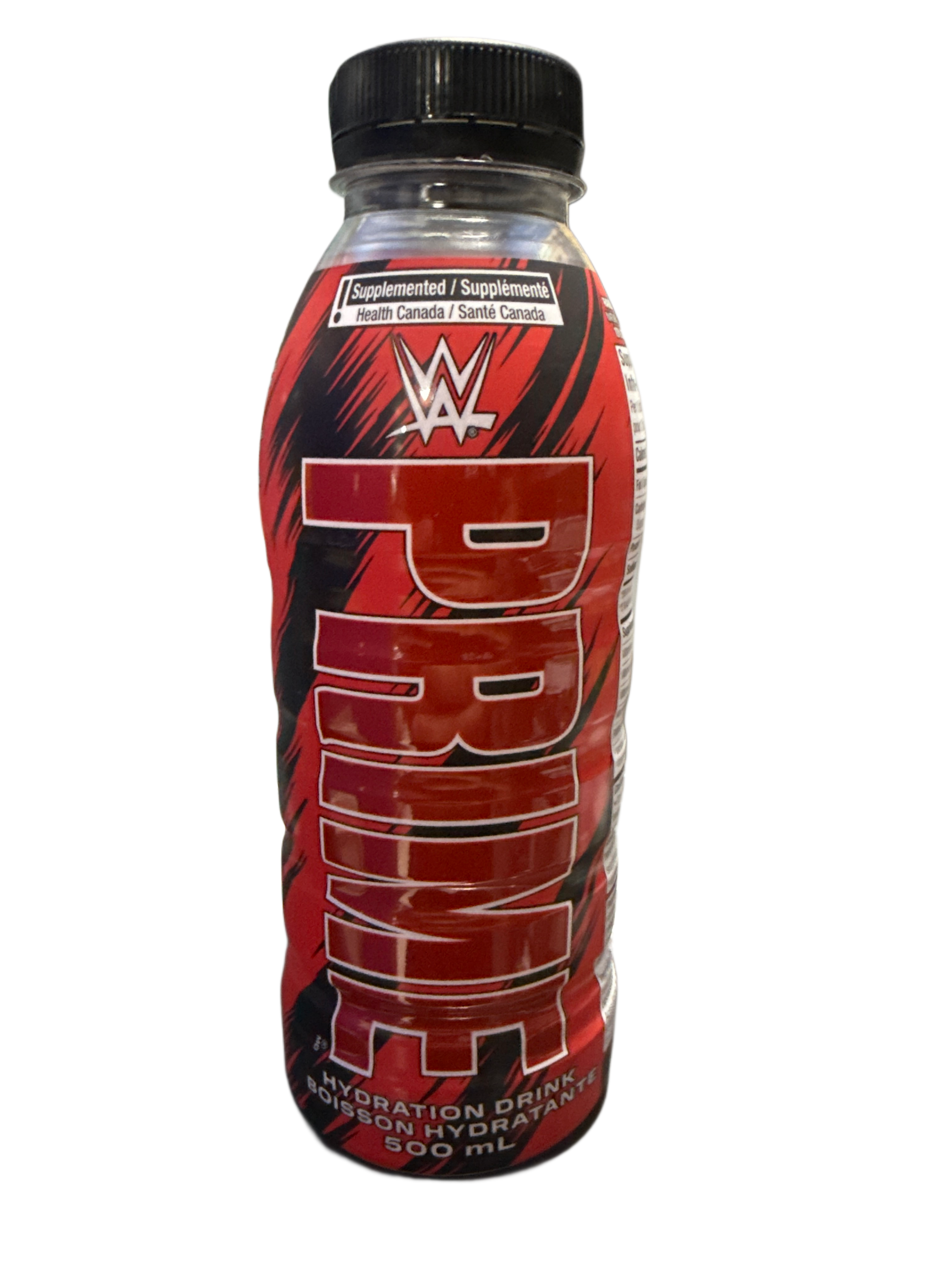
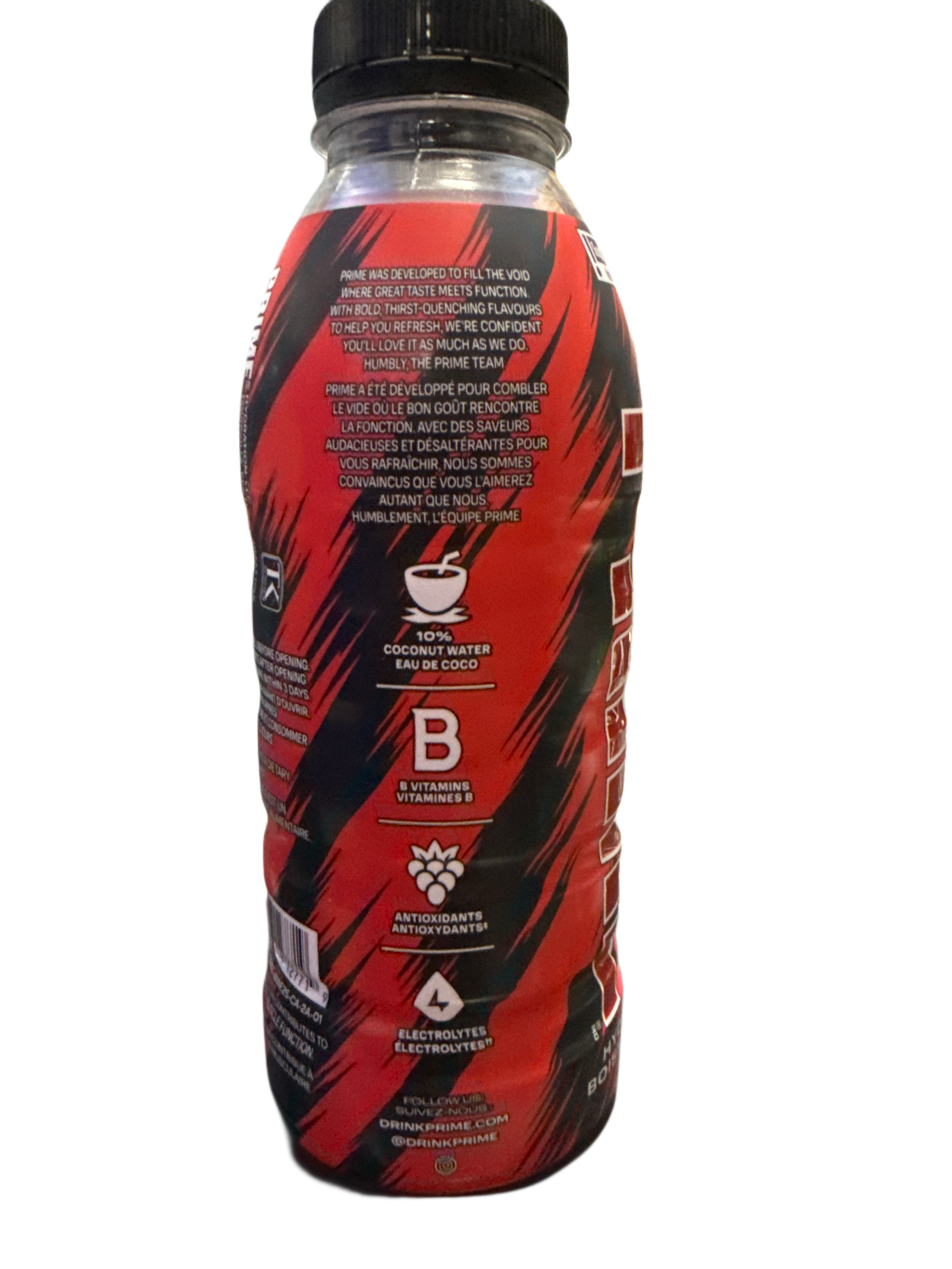
Most obviously, the label includes the required French text and an additional health alert at the top, in line with Canadian packaging regulations. Beyond that, there are visual tweaks that keen-eyed fans will notice. The PRIME logo itself has a slightly darker red tone compared to the US version, and the WWE logo at the top is outlined with a thicker black border, giving it a bolder and more defined look.
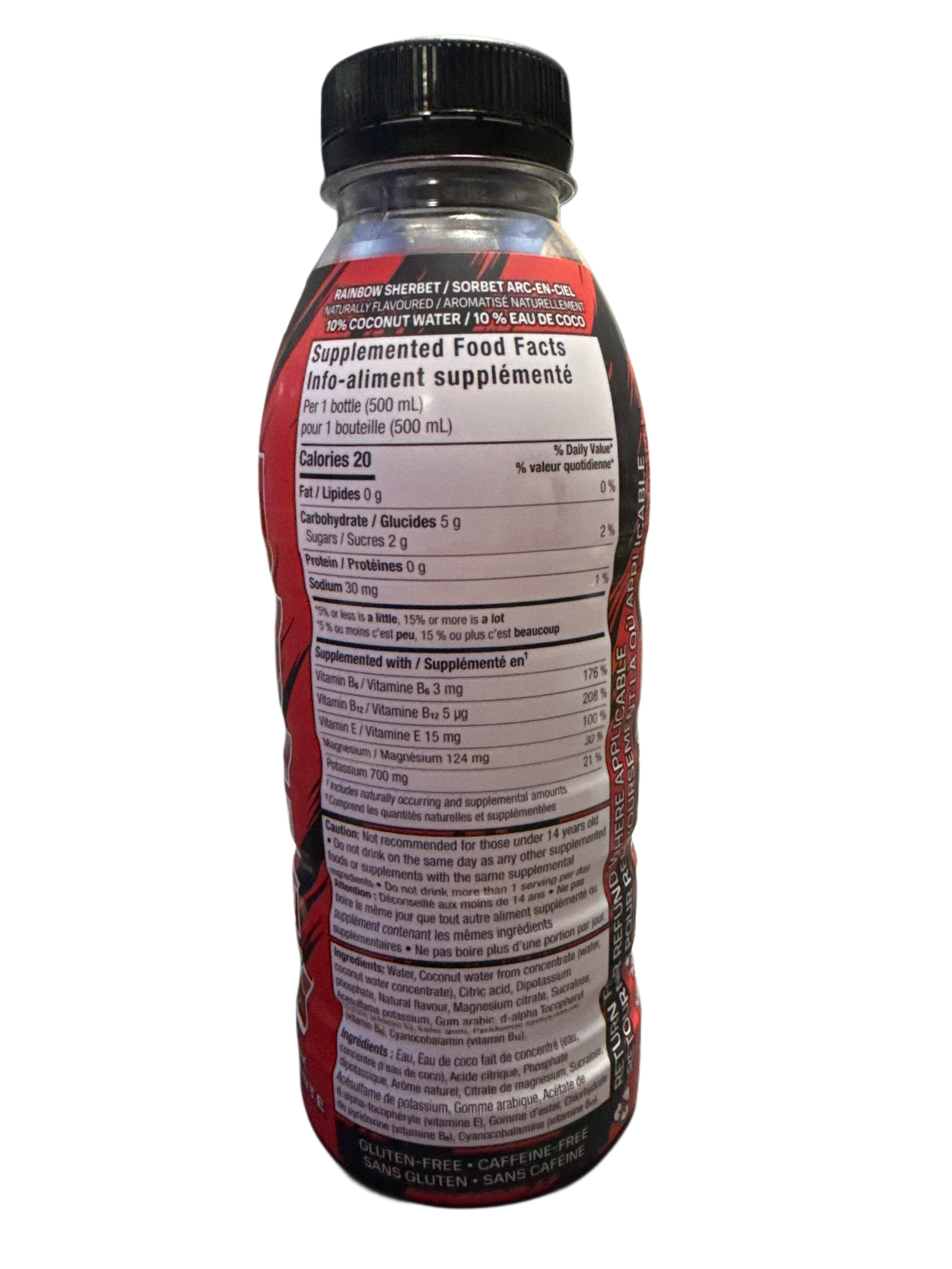
Another key difference lies in the flavour. While the US WWE PRIME was Meta Moon, the Canadian release is Rainbow Sherbet – the same flavour used in the popular Future Freeze bottle. This blend brings a fruity, nostalgic mix to the WWE collaboration and offers something distinct for Canadian collectors and fans to enjoy.
With these changes, the WWE PRIME bottle isn’t just making an international appearance – it’s arriving with its own identity.

 Donate us a PRIME